Pikquik case study (ACAD 324 final project)
PUBLISHED OCT 1 2023
During Fall 2022, I took a class as a part of my major, The Practice of Design: Ideation to Innovation (ACAD 324). Our final project sought to determine a niche problem space, design a solution, and then evaluate that solution. We tackled the problem in teams of 5 or 6 students each, for about a month. Thanks so much to Iris, Jack, James, and Noy, for being wonderful teammates, and to Professor Davina Wolter for leading the class. This was definitely not a solo mission. I’m excited to discuss the process behind our final product, Pikquik, a physical stand and mobile app for efficient and fun festival food distribution.
Don’t want to read the whole thing? Check out the final documentation Figma here.
Step A: analyze and define
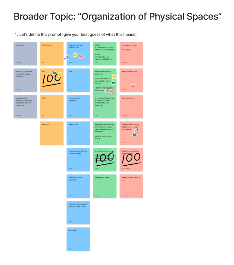
Before we began, our team’s scope was restricted to the organization of physical space (still a very generous scope). We jammed on different interpretations of “physical spaces” to develop niche definitions to explore within. We briefly discussed each idea, voted on our favorites, and decided to focus our research on crowd safety at music festivals.
After settling within the festival experience scope, we developed our “how might we” statements and problem statement. These were centered around the juxtaposition between a festival’s purpose and its frequently unsafe crowds: that which brings a bunch of fun-loving, music-loving people together, yet potentially leads those same people to getting lost or phsyically crushed.
- How Might We… address a problem we both uniquely understand and can apply a multifaceted mindset towards?
- Problem Statement: Festivals should be delightful experiences, yet the spaces they occupy are often the opposite.
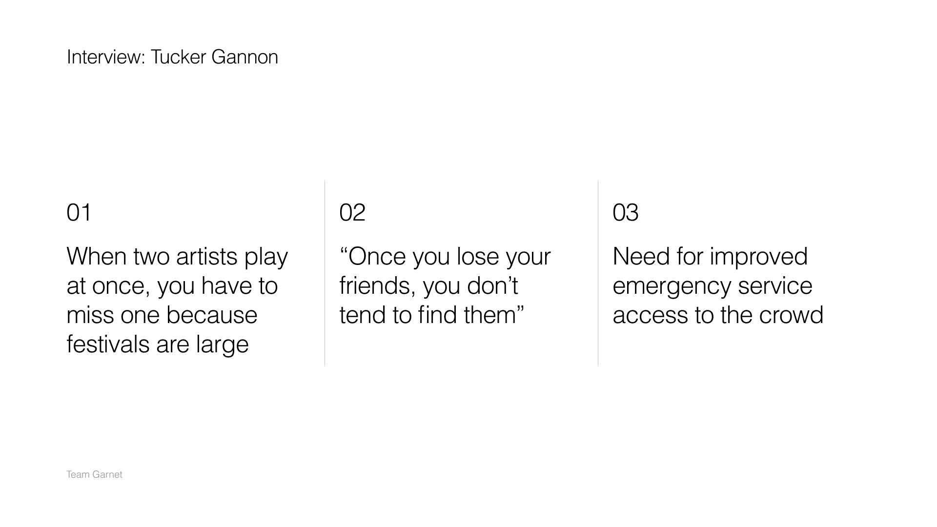
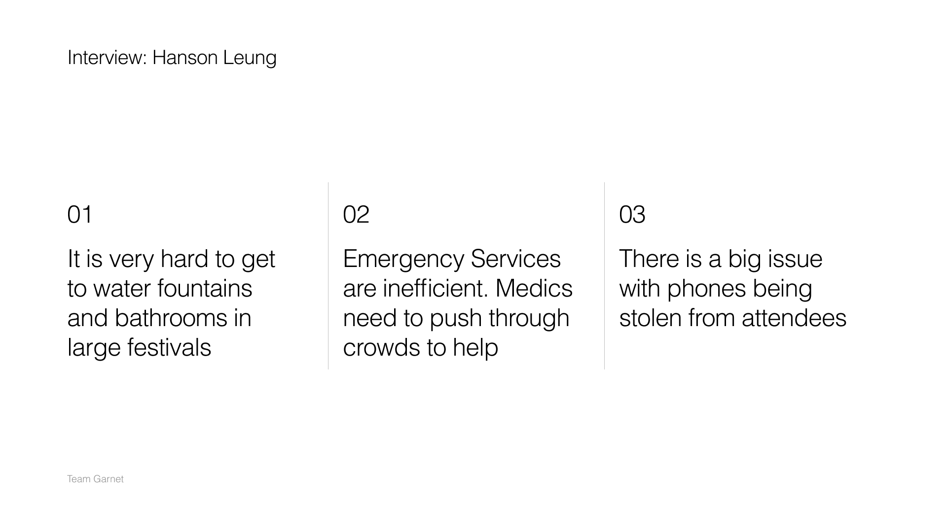
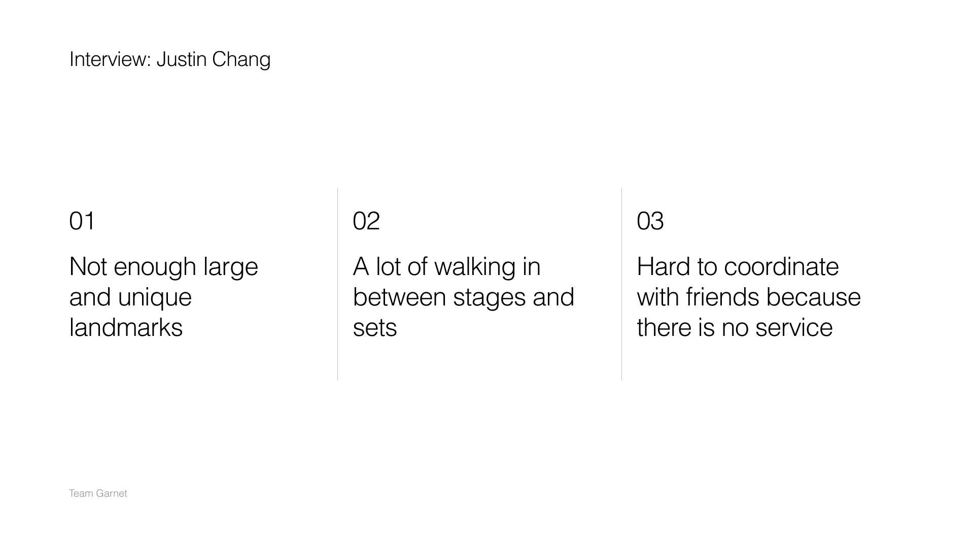
We also conducted a few interviews while developing these statements, which echoed the sentiment that festivals can be overwhelming and difficult to navigate. Huzzah! A physical space that could benefit from organization.
Step B: ideate and select
After defining a problem space, we set to work with ideating potential solutions. We tried multiple different brainstorming methods: encouraging crazy ideas, making forced connections, and exploring “what if” scenarios.
During this time, we also pivoted to focus on the problem of parking at festivals. We chose this new area based on new interviews that highlighted its importants, and we still stuck to the previous theme of optimizing the “less fun” parts of a fast-paced, high-energy festival experience.
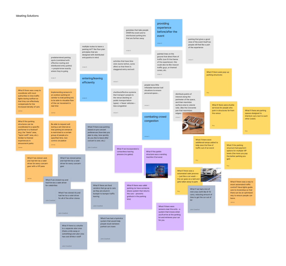
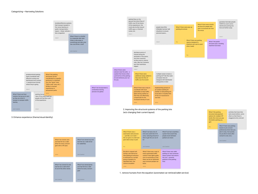
Some hilarious ideas that came out were car vending machines, artist-themed parking areas, and even inflatable hamster balls to protect personal space. After grouping these ideas into central themes, we selected three potential solutions:
- Solution 1: Remove humans from the equation. Expedite the leaving process by creating an automated valet system that retreives cars.
- Solution 2: Improve the old. Redesign the structural and signage systems in current parking lots.
- Solution 3: Make it part of the experience. Coordinate the parking structures with certain acts and performers.
Step C: implementation and brand
Somehow, we pivoted again! Inspired by our previous goal to alleviate congestion and traffic when leaving a festival parking lot, we also heard quite a lot from interviewees about how difficult it is to buy food at a festival. Festival-goers have to leave the stage areas with their favorite performing artists just to stand in an egregiously long line for expensive food. This time cost is uniquely important because people have paid so much to be at an event like Coachella or Lollapalooza, and they deserve to make the most of their money. We wanted to make this process faster and more fun, so that festival-goers would not only have fun while ordering their food, but they’d also be able to return to the main attractions faster.
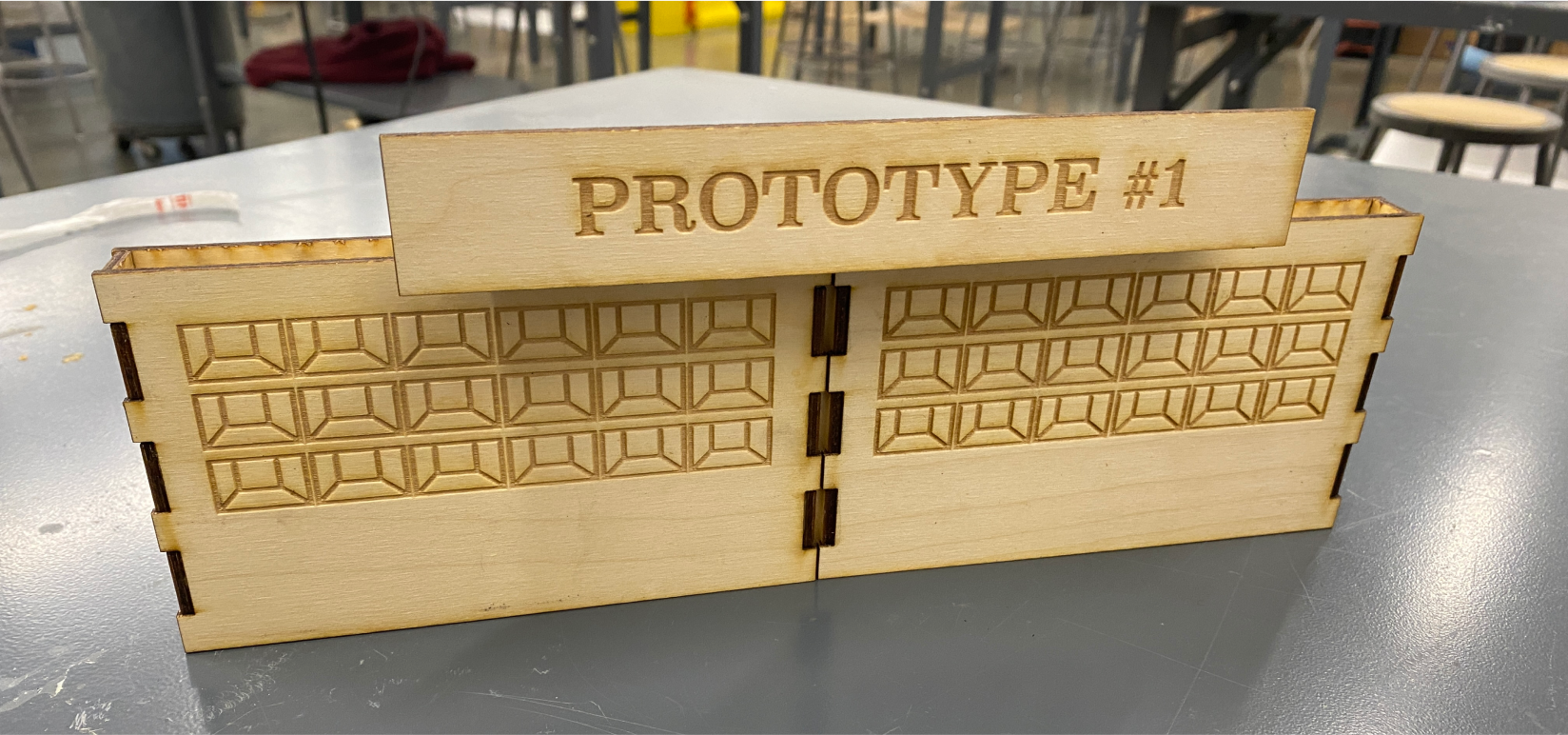
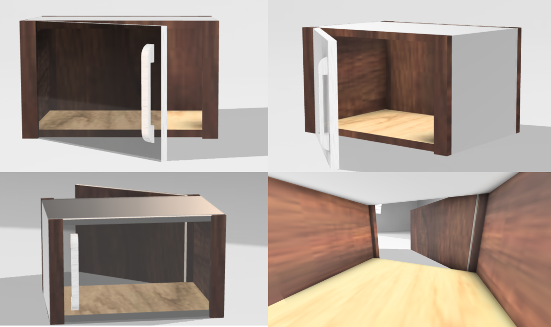
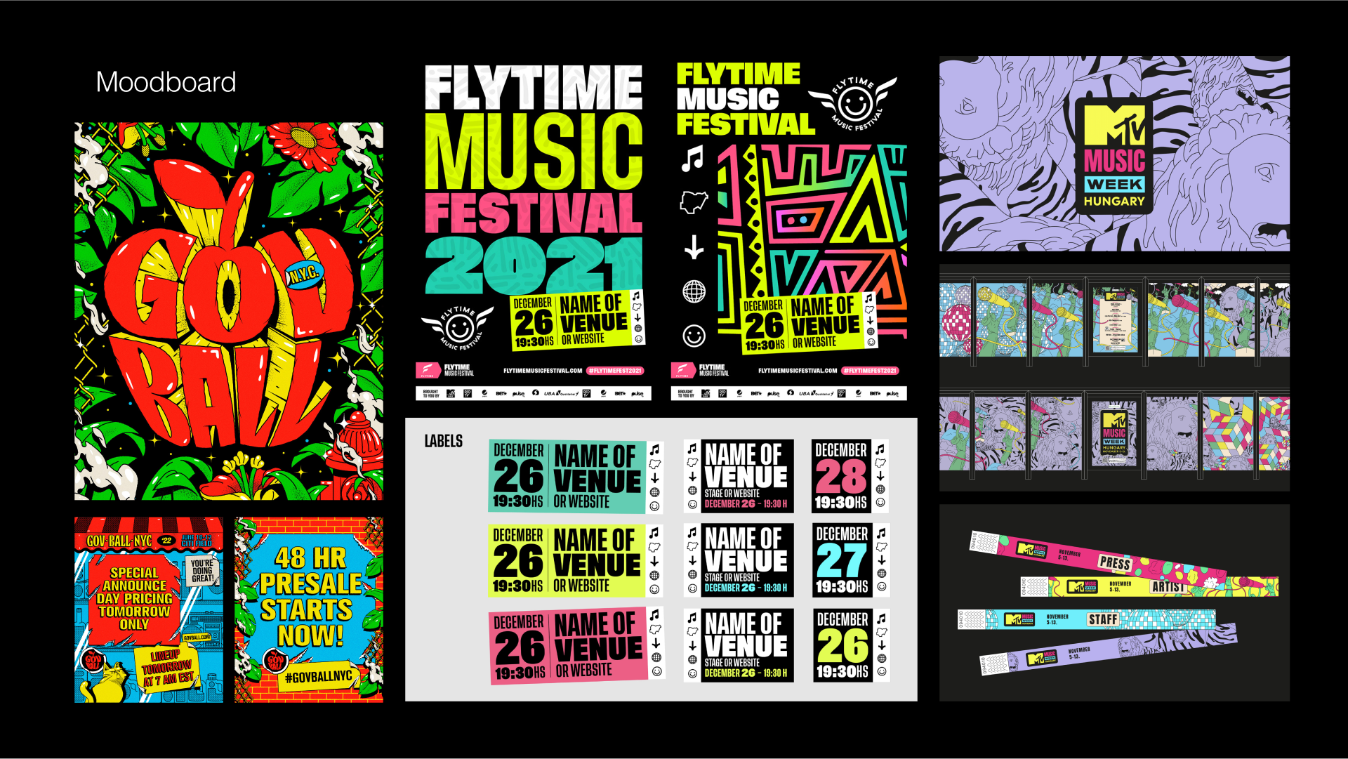
Our new solution was an automated dispensary of fresh food, where users could order food from anywhere in the festival space using a mobile app, and then pick it up at a predetermined time from a locker-like area. This would control foot traffic in the vicinity of the food area and allow vendors to properly estimate demand throughout the duration of the event. Vendor workers would be able to make food on one side of the booth, and place the individual orders into lockers, where users could grab their food from the other side. Here are some of the prototypes we made, as well as our moodboard! Physical prototypes courtesy of Noy and Jack :)
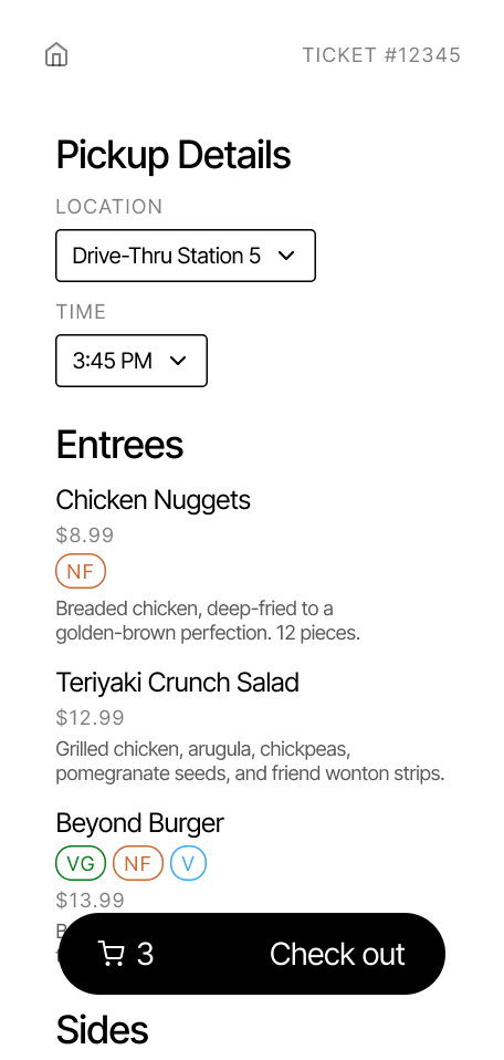
Iris and I also designed our first wireframes for the food-ordering app. We came up with two visual prototypes to be evaluated:
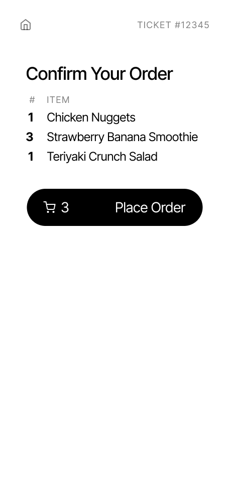
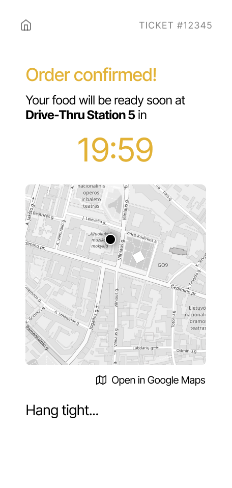
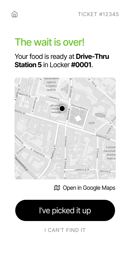
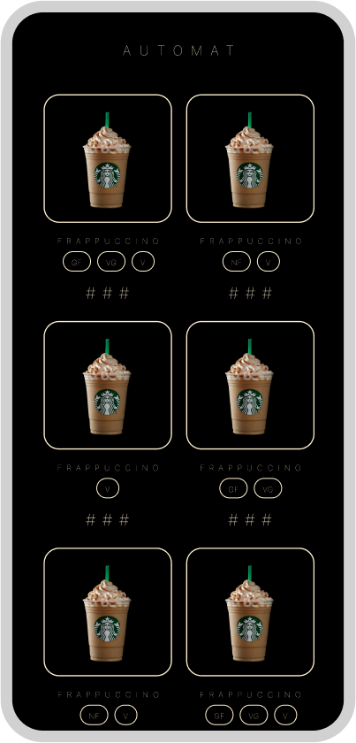
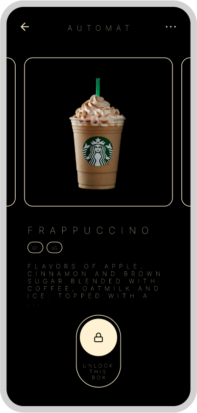
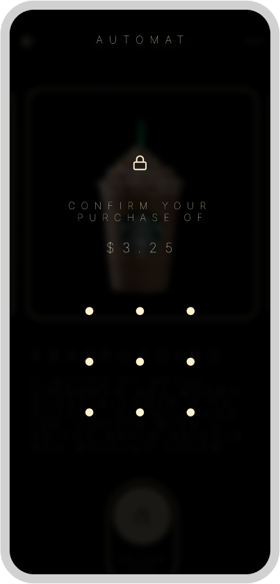
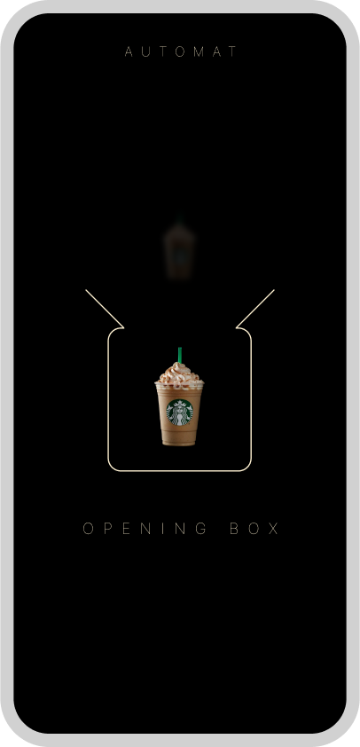
We chose to name the product “pikquik,” since eating at a festival is outdoors and kind of like a picnic, and we also wanted it to be “quick” and seamless. Hence, “pik-quik”!
Step D: evaluation
During our evaluation process, we put our visual and physical prototypes by asking potential users (and our professor) for their opinions. For the physical prototype, we were encouraged to explore contact-less options, so that the user would not have to pull a door handle. Instead, they could tap a button from their phone app to activate a sliding door. We were also asked to create a full-size prototype, which we gladly did.
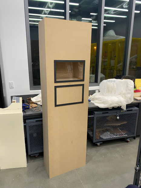
For the visual app, we brought elements of both prototypes together. Certain features that we decided to include in the final design included:
- locational and time features, such as selection fields for pickup details, the map to indicate the pickup station, and the timer countdown
- a swiping passcode feature, which creates friction for users and ensures that their action is intentional, especially when they might be inebriated or distracted at a festival
- pictures to show the food items on the initial menu
- an animation to match the sliding door function that is occuring in real life
We also incorporated our moodboard into our visual design! These are just a few snapshots, but you can view the Figma with the final documentation and mockups here.
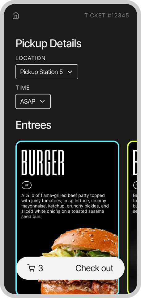
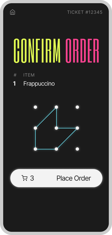
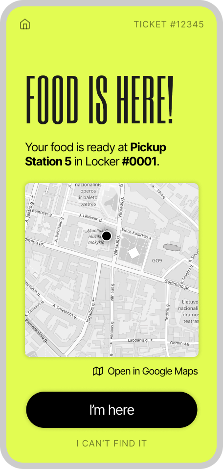
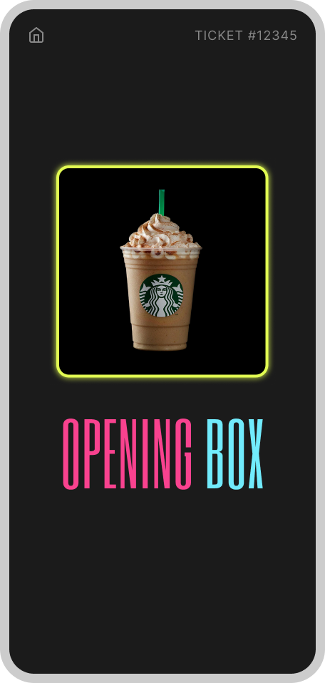
If we had more time to work on this project, I would have loved to add many more of the logistical features that would make sense for this app, such as errors and warnings when users are not near the pickup zone, or if they fail the swiping passcode check, or if they need to communicate with the vendor. Moreover, I’d love to further explore the payment UI/UX for the app. Where would they see and modify this information? What would integrations with Paypal and Apple Pay look like? Should users load money into their digital wallet as part of a separate user flow?
As another part of our evaluation, we also sent out a survey to our target demographic (GenZ festival-goers). We asked directed questions to reaffirm the most frustrating parts of the festival experience.
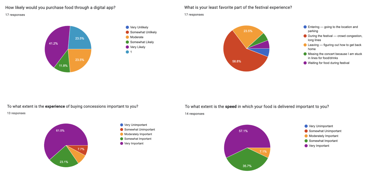
From this survey, we learned that 92.3 percent of respondees viewed their concessions experience as at least moderately important, all respondees valued concessions speed, and 58.8 percent of respondees found long lines to be their least favorite part of the festival experience. Moreover, it seemed like Pikquik could very well be the answer, as at least 76.5 percent of respondees would be moderately likely to purchase food at a festival through an app. Success!
Final notes
FINAL DOCUMENTATION HERE!!! Please click and take a look, it’s awesome!
What a ride of a one-month project! My team was instrumental to bringing this idea to life, and we also learned so much about design research throughout the process. We’ve tabled it for now, but maybe you’ll see Pikquik someday in the future!
