Interning at the New York Times (2022)
PUBLISHED SEPT 24 2022
This past summer, I interned at the New York Times on the Interactive News Team (INT)! I’ve had the pleasure of working on many projects at the Times, from UI/UX design to spreadsheet wrangling to illustration to fullstack software development. I had such a wonderful experience with the team and with the company, and I’m elated to share what I’ve learned.
Work-related projects
These were all so fun, I swear. Primarily elections, but also some one-off projects. The elections rig is written in TypeScript, Next.js, and a home-rolled variation on Sveltekit, with express and PostGreSQL handling the backend (if you’re curious)!
Elections asset layout editor
This was one of my biggest projects of the summer! Essentially, our elections reporting rig is composed of several apps which gather data, manage election events, publish pages, and more. The election-pages app previews and renders all New York Times election results pages. I worked on an interactive wysiwyg-style editor for elections asset layouts.
Let’s imagine that it’s a hectic election night and the Alabama Governor’s race gets really interesting. Everyone has their eyes peeled. We’d want to move the AL Gov. race to the top of the page. However, to change page layout and attributes, we currently have to go into the code, edit a complicated json, and re-deploy. Once again, it’s intimidating for those who aren’t already knee-deep in the elections reporting apps. This interface allows users to rearrange sections and edit properties without ever touching the code.
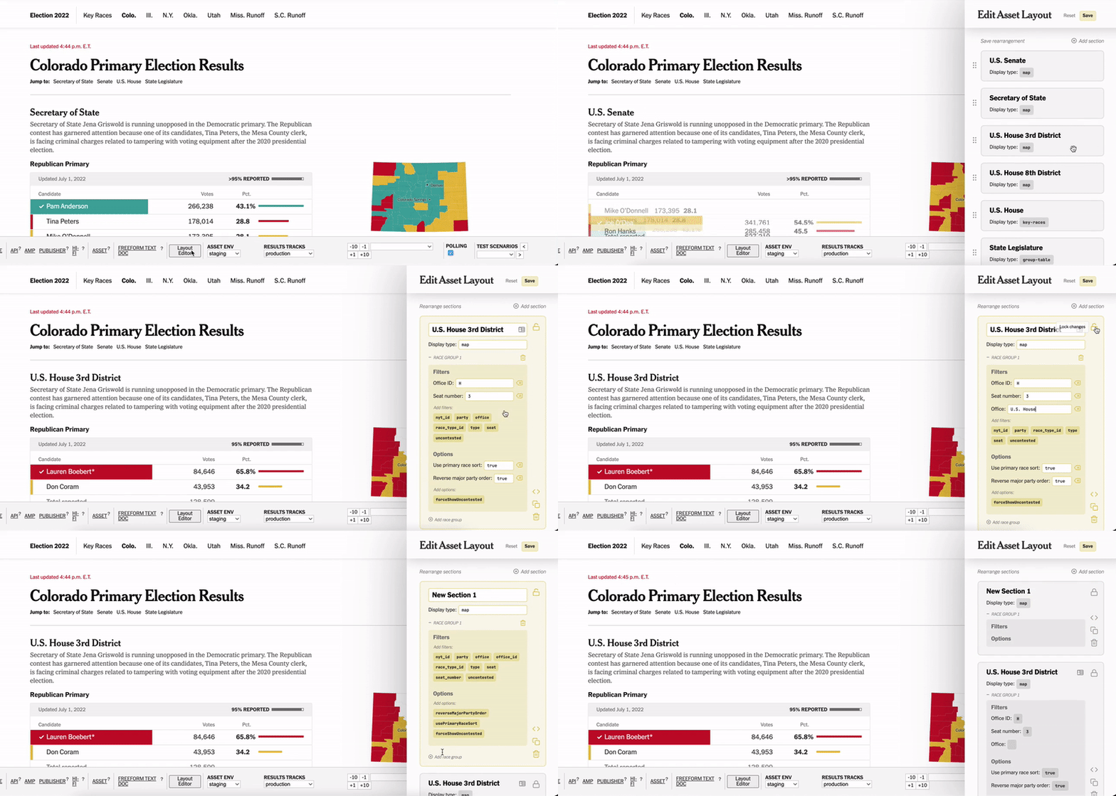
I designed this interface in Figma and developed it from scratch. I spent significant time in the sea of CSS-styles, dealing with broad aesthetic and microinteractions. I also connected my interface to the rest of the app, pulling in existing page layouts and creating APIs to send the layouts back to the election-admin app.
UI/UX improvements in the election-admin app
One of my first projects on INT was a UI/UX audit of our election-admin app. election-admin is responsible for managing events and assets, whether they be standalone pages or embedded into others (such as on the home page). More specifically, I tackled the interface used to create and edit these assets. Having a more user-friendly interface would make it easier for different people to configure elections without significant training. We’d be able to run election nights more reliably and with fewer people.
Here’s a detailed rundown of some changes that I implemented:
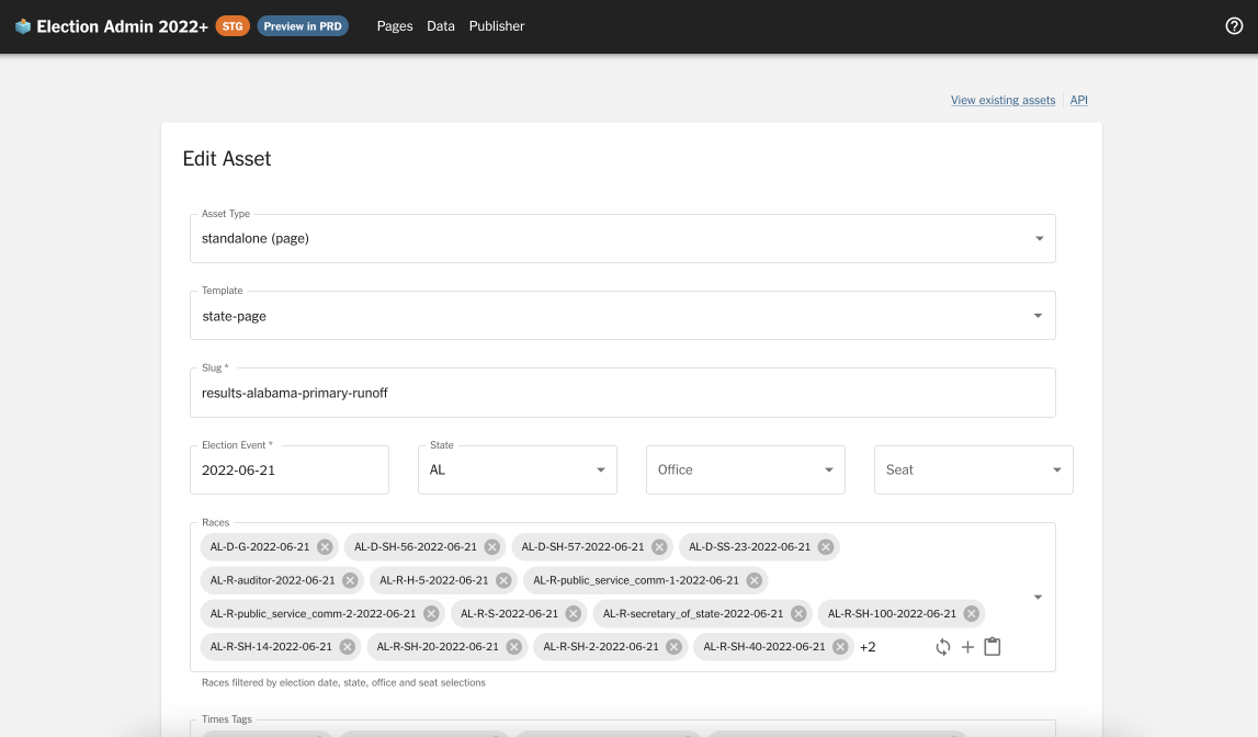
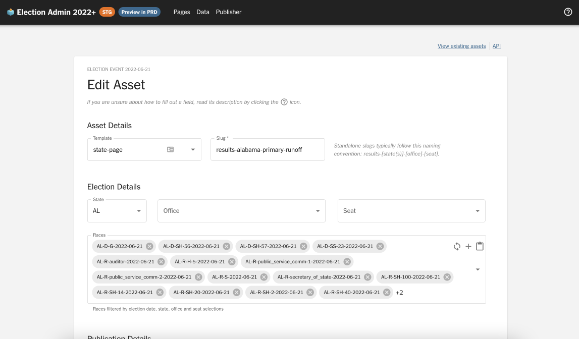
For this first side-by-side comparison (above):
- I introduced section headers, splitting up the fields categorically to make the interface more self-explanatory. These include Asset Details, Event Details, Publication Details, and Advanced Options
- I adjusted the widths of many text fields to match their intuitive widths (e.g. a state code like “CA” will never be as long as the full screen)
- I hid inferrable fields like
Asset typeandElection event - I rearranged the order and layout of the form fields to reflect the user’s priorities, rather than the developer’s
- I added captions and documentation as necessary to guide the user through the form
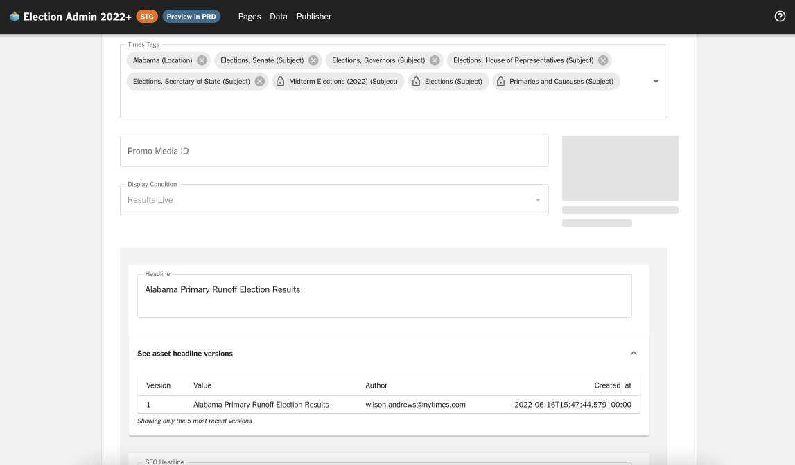
For this second side-by-side:
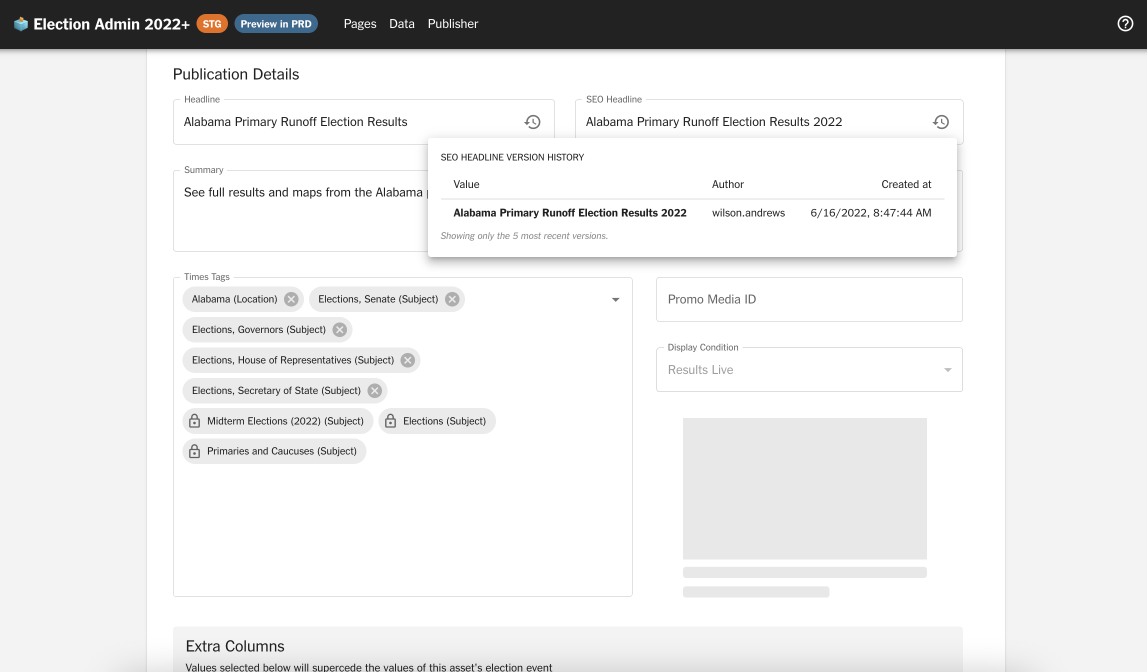
- I slimmed down the version history display: rather than an expandable, full-width accordion, I created a popover with more readable formatting
- I untangled the arbitrarily grouped version history fields (also see images below), and rearranged them to make intuitive sense to the user
- I rearranged the layout of the publication details (Times Tags, Promo Media ID, Promo Media Preview, and Display Condition) to optimize text field widths and create a larger space for the image preview
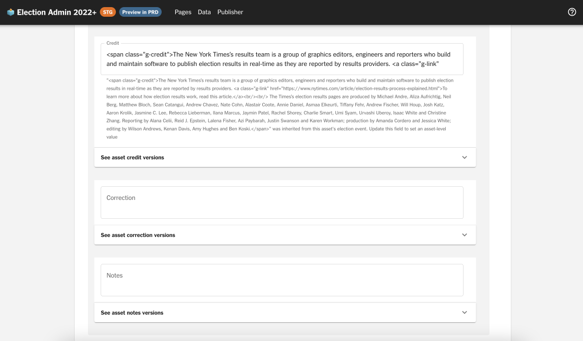
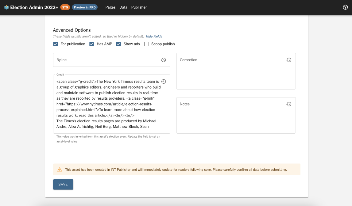
- Similar to the above, I was able to slim down these publication details significantly, simply via the version history popovers and a layout rehash
- I moved the rarely-edited-but-nice-to-have fields (Byline, Correction, Credit, and Notes) into the “Advanced Options” section, which is hidden by default so as not to overwhelm users
As an interface that is touched frequently by many people, this UI/UX audit and refactor ultimately had a pretty positive impact. Several months later, it’s evolved to become even better!
Trending races component
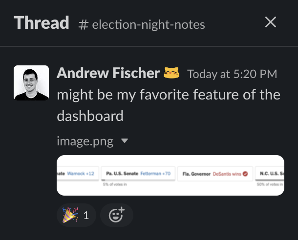
Finally, a project that is live! This trending races component was developed for the front page of the NYT elections results. It became one of my primary projects during October and November, and I’m thankful to have owned a feature that was so central to the Times’ election visuals, from the design to the development, animation, algorithm, and testing.
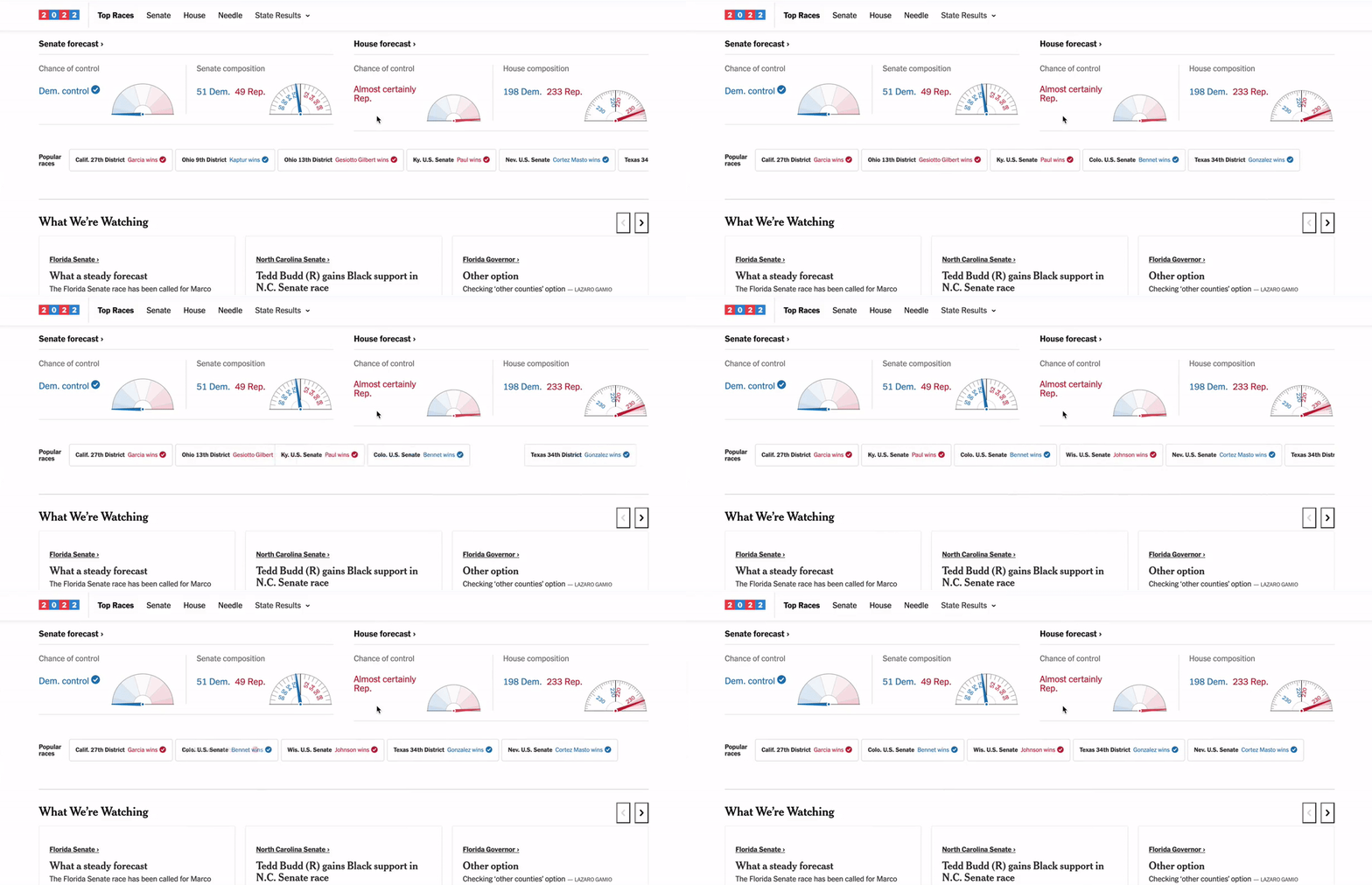
I’d followed the project from its inception, back when we weren’t even sure what exactly to do with Chartbeat API data that we were collecting. Soon after we settled on the idea of a trending races component, I became the primary designer and developer for the feature.
I pushed for design changes that clarified our vote percentage bar, where the reader might otherwise find it ambiguous. Adding a numeric label significantly improved the reader’s ability to understand a race’s status with just a quick glance. After interviewing several team members (as well as some friends and family for the layman’s view), I chose a variation that incorporated a descriptive label while still matching the brand guidelines.

In a way, GitHub code reviews were also my user interviews. Although I did not start out with such a thorough approach, I quickly realized the importance of determining every possible state that the component could be in, and ensuring that we’d optimized the design for that state. Beyond the “mid-vote count” and “called” states, there was also a “no results” state when races weren’t reporting yet, a runoff state, and more. I continuously iterated based on my team’s feedback, making adjustments to improve the component’s clarity.
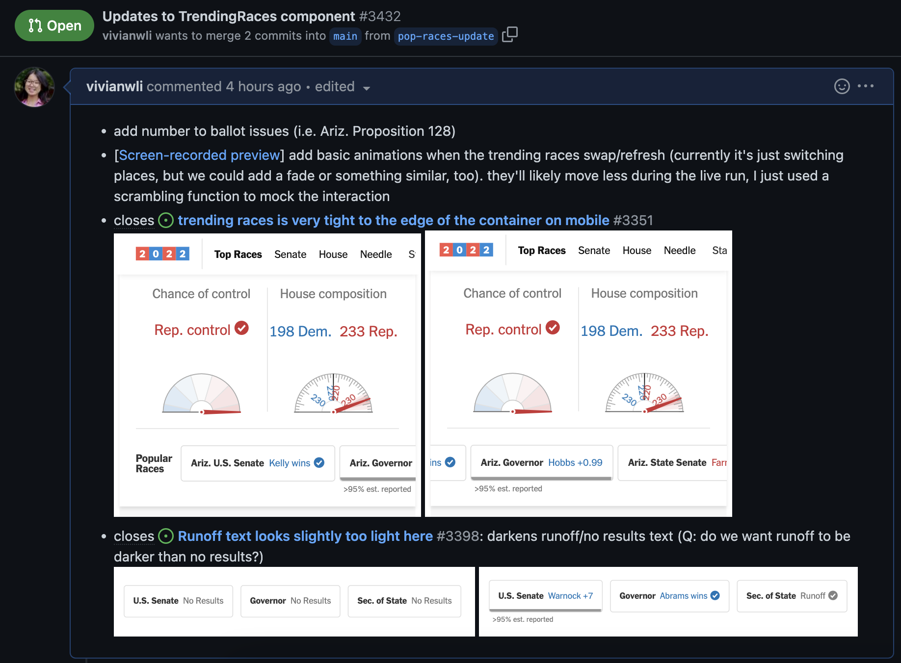
Alongside the Times audience team, I contributed to our trending algorithm that used total page views and top change in views to show what captured readers’ attention in real time. I implemented our algorithm logic in code, surfacing five races with the top views overall, and five races with the biggest change in views from the recent time period. Working on this was definitely high-stress, but it felt so rewarding, too.
Self-driving car crash data
A spontaneous, opportunistic project! The NHTSA released a data dump of self-driving car crash reports on June 18 at 9 am. The dataset encompassed several hundred crashes with cars using advanced driver-assistance technologies. As soon as I got to work that day, I began searching the datasets for narratives and interesting patterns. By lunchtime, I’d generated dozens of pivot tables and statistics to understand location-based patterns, crash contact patterns, redaction patterns, environmental conditions, and descriptions. By 3 pm, the article was live.
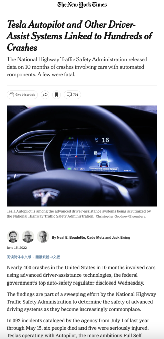
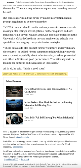
Most of all, I loved being able to respond to the journalists’ needs. Neal Boudette, Cade Metz and Jack Ewing worked on this article. Throughout the morning, they would propose different hypotheses in our Slack channel, and I would provide quantitative verification or insight based on the data. The process was far more fast-paced than I had anticipated, and it was pretty exciting!
Since then, I’ve been able to work on similar data projects (e.g. New York state campaign finance data) and newsroom tool fixes based on journalist feedback.
Semi work-related projects
Maker Week 2022: Design systems library
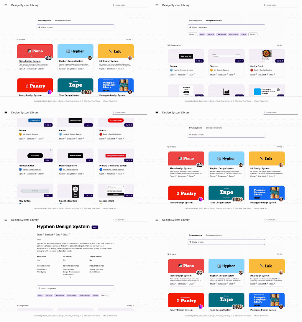
Maker Week is a week-long internal hackathon that the New York Times hosts every year. Some ideas become the seeds of instrumental NYT products, while others are just for fun. I chose to work on a tool that aimed to consolidate NYT’s abundance of design systems: the Design Systems Library!
Our project idea came from a very practical perspective. The Times has at least 12 distinct design systems, each with their own components and flows. However, communication between systems can be weak, and teams are constantly doing duplicate work. We envisioned a utopia where NYT project developers could browse a comprehensive library and pull in components from design systems for interchangeable use.
I was involved in the design research and prototyping for this project. I spent several days compiling analogous solutions: Material UI docs, Google Fonts and Icons, Storybook, etc. Based on these findings, we then designed an interface that would allow users to browse components via tags, filters, and design system pages.
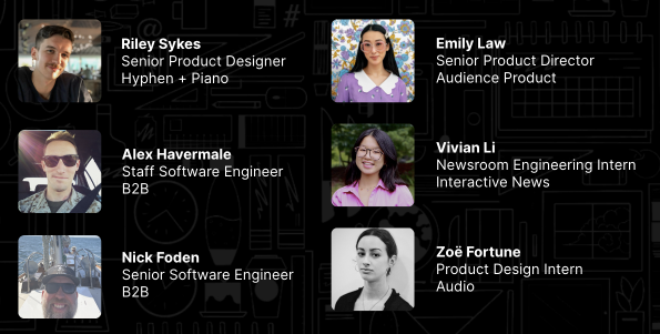
Our Maker Week project ultimately won Most Likely to be Used by Everyone. I was able to work with so many extremely talented people across different teams at the New York Times. Collaborating outside of my team bubble proved to be super insightful. Here’s my team that made this project possible:
Maker Week T-shirt design
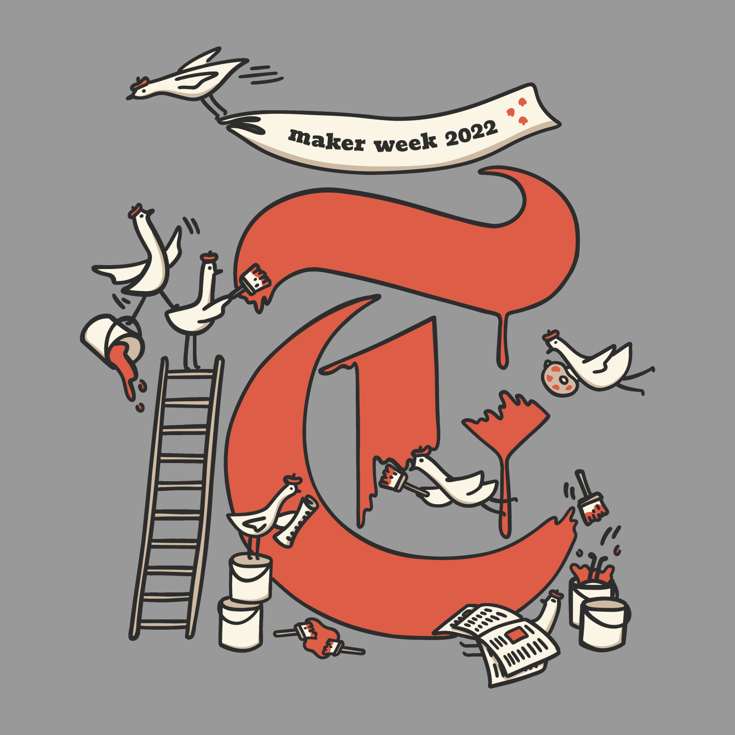
I love illustration (and it’s only recently become less of a hobby interest), so I decided to shoot my shot and have some fun with this one! I submitted a design featuring a team of birds collaborating to paint a Times “T”. So goofy!
I ended up winning the T-shirt design contest, which honestly brings with it an unwarranted amount of clout. It was hilarious to see so many of my coworkers wearing the shirts to the office and in meetings. 10/10 tradition :)

Intern newsletter
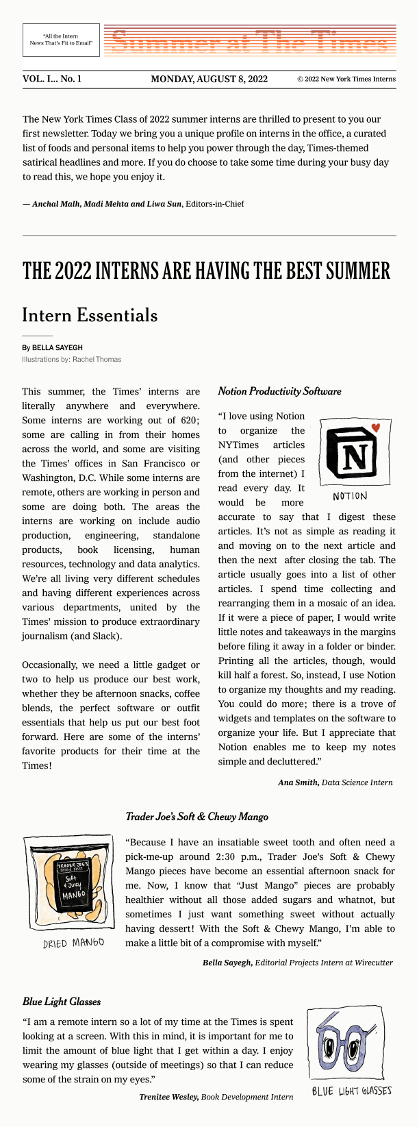
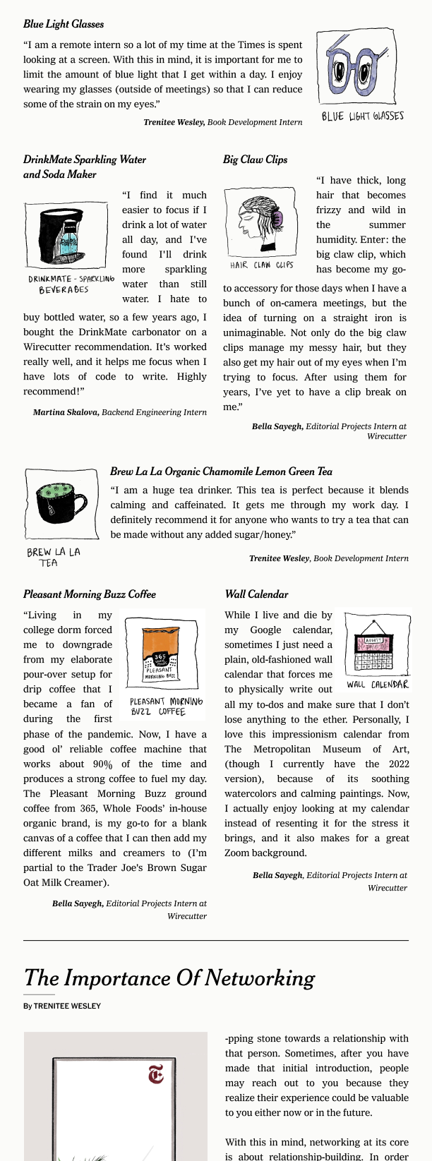
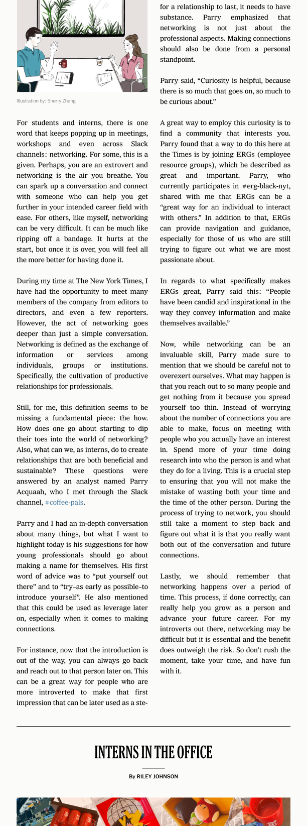
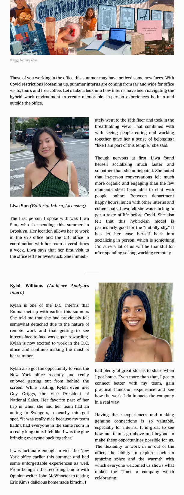
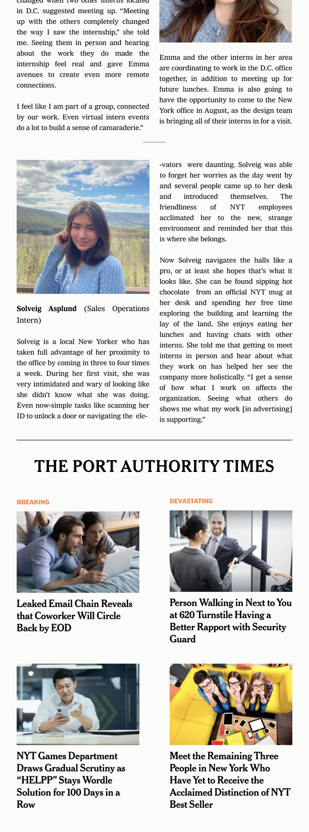
This summer, our intern class produced two newsletters, with all articles and accompanying media created by Times interns. I designed the 2022 newsletter layout with Zoe and Kalynka in Figma. We aimed to replicate the print-newspaper-esque aesthetic while still maintaining readability in the narrow format of a newsletter. As product design interns, they imparted wonderful design insight that I learned so much from!
Community and experience
I couldn’t have had a better summer. My team and the intern program provided great support, and I also took a fair amount of personal initiative.
My team director Ben set up coffee chats between me and each person on our team, so I got to know everyone personally. These introductions made me feel so much more welcome in the office. I also took advantage of the opportunity to chat with those outside of my department at the New York Times—Graphics/Digital News Design folks, art directors, food reporters, Games developers, you name it.
The employee resource groups were a great way to stay connected beyond work projects. I participated in the July book club for Times Reads, learned about NYT sustainability initiatives with the Times Climate Network, and attended the Womens Network seminars.
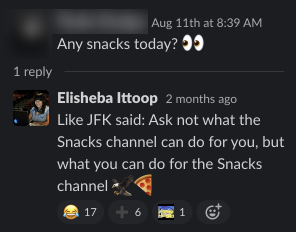
My heart also goes out to the #snacks channel. Several times a week, people would post excess food from events to this channel, free for the taking. Every day felt like a new adventure! I loved the spirit of generosity here, and I was even able to contribute food once myself, too.
Within INT, we had our own monthly picnics and an “NYHQ Week,” where our remote teammates flew out to New York for an in-person week. Between team coffee runs and bagel tastings, NYHQ Week really strengthened my connection to the team. Everyone on INT is so down-to-earth and thoughtful. I especially want to thank Aaron, our Party Planning Chair (a very official position). I typically can’t eat the sweets provided at celebrations due to my dietary restrations. However, for my final toast with INT, Aaron went out of his way to order a cake from a dedicated vegan and gluten-free bakery. It made my week :,^)
Finally, I cherish the time that I spent with my fellow interns in and out of the office, as brief it may have been. I’ve made friendships that will last well beyond the duration of the internship!
On getting the internship
INT’s internship application process exceeded my expectations. Here’s what happened:
STEP 1: I found the application on LinkedIn and applied through their Workday portal. They asked for the usual resume, as well as a few short essays. I could tell they were looking for applicants with a genuine interest in the intersection between journalism and software.
STEP 2: I did an automated video interview. This one honestly wasn’t great. The platform would ask a question, count down, and then film my timed response. There were no re-dos, and it cut me off automatically after two minutes.
STEP 3: I did a behavioral interview with my potential manager and one other team member from INT (Scott and Annie!). Scott sent me the questions a few days prior, so I was able to better understand the team and gather my thoughts. Instead of a traditional technical interview, I did a walkthrough of one of my previous coding projects.
STEP 4: I got the internship!
As someone who isn’t a CS major (and hasn’t leetcoded much), this tech interview alternative allowed me to present myself in the best light possible. I felt more comfortable, and I was able to highlight my thought process. Tech interviews can certainly be crucial to finding skilled candidates, but this interview is a great example of assessing candidates more holistically and broadening the barrier to entry for SWE roles.
Thank you!
Thank you so much to everyone at the Times who has made this summer such a valuable learning experience. It’s a notable investment that the team makes every year, and I felt so welcomed every step of the way. Thank you Asmaa for being the best mentor I could ask for—thinking of our 1:1s always makes me smile. Thank you Ben, Rachel, Scott, and Amy for ensuring that I had engaging projects to work on, and constantly reshaping my NYT path to fit my interests. Thank you to Andrew F. for sharing incredible advice as my “intern buddy”, as well as to my intern friends for being my partners in crime (Zully, Zoe, Connie, and so many more). Thank you to the INT team as a whole—you all are the smartest, kindest people that I’ve gotten to work with. Thank you to the Maker Week Team, to folks in the #snacks channel, and to Ashton and Nya for hosting a successful intern program. I hope we cross paths again!