Made with Svelte(Kit)
PUBLISHED JAN 18 2022
So, Svelte is not for the faint-hearted. 😭
Not that I don’t recommend it. Svelte and SvelteKit are intuitively wonderful in many ways—enough so that someone without years of web dev experience (like me) could pick it up fairly easily. However, because it is such a new framework, I came prepared for the frustration that ensues when things just don’t work.
I’ve also been entertaining the idea of creating a layman’s guide to building a personal website for a while now. I was pretty set on giving my personal website a refresh this winter break (check out the old one, vivsdivs.com). It seemed like the perfect opportunity to learn something new and share my experience. If you’re interested in how I made this website—what came easily, what to avoid, etc., read on. I hope you find something useful :)
Why Svelte? There are so many great options out there. The short answer is that I love The Pudding, and they use SvelteKit. Also, it seemed that a reasonable amount of people have moved their blogs from Gatsby to SvelteKit, in the same way that they moved from Jekyll to Gatsby a few years back. Might as well be ahead of the curve, right? 😉
Preparing for battle
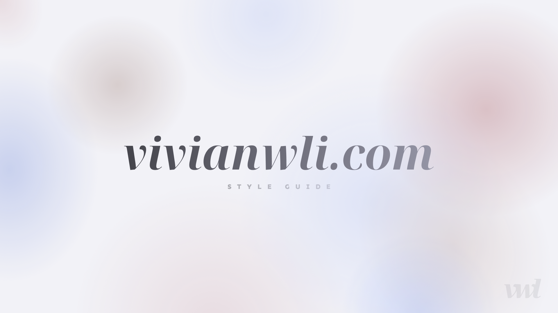
I first spent three days in Figma designing the website, from color scheme to style guide to full layouts of the home, blog, and portfolio pages (in both desktop and mobile view). Honestly, it was a lot of work, but it set me up for success when actually coding the site, and I didn’t have to question my design decisions down the line. I’m also glad that I prioritized the mobile view early on, instead of freaking out about responsive design long after the rest of the website was implemented. I love Figma (so much), so no complaints here. Feel free to browse my Figma document if you’re curious! If you’d like to dive deeper into about my design process, let me know and I might make a more design-focused post in the future.

Before I popped open the code editor, I also started by doing the Svelte tutorial in full. It was very interactive and helpful, and it also set me up to know which resources to reach for later on. I also took notes on what I learned from the tutorial. They’re not amazing, comprehensive notes or anything, but they show the amount of preparation that I did before taking the plunge.
Now, we’re ready. Onward!
👍🏻 things
Floating orb background
This is probably one of my favorite aspects of the website. I had it all planned out in Figma from the beginning. I originally found this complicated generative art solution with PixiJS by George Francis. It’s really, really cool, and I had so much fun just playing with his CodePen. However, I ultimately decided to stick to the basics using spans animated with CSS. When in doubt, follow Ginkoid’s advice:

Here’s the CodePen that I referenced, which did the job wonderfully!
Svelte(Kit) stuff
- The docs: I loved the docs, for both Svelte and SvelteKit. So wonderful and helpful, 10/10. This is where you learn about all sorts of fun things, like SvelteKit’s modules (
$app/environment,$app/stores, etc.), loading, and anchor options. Had my back when Stack Overflow didn’t 🥲 - SvelteKit’s file-based routing system: very intuitive! It works exactly how you think it does—each page goes into
/routesas a.sveltefile. - Svelte transitions: super easy to use with really beautiful results. I used them for my page transitions (and I really could start throwing them everywhere). One of the quickest things that I did to elevate the feel of my website. The transition usually only runs when your component enters and leaves the DOM, but you can also trigger the animation on a value change with a #key block.
Flexbox, Grid, and other common CSS utilities
Even in the presence of ✨fun new technology✨, one must not forget about good old flex and grid. I read through the complete guides this time (flex and grid), thanks to CSS-Tricks. With these tools (and units like fr and min-content), creating responsive layouts was honestly pretty fun. One example: grid was key to creating the faux file folder on the portfolio page.
Essentially, I have an SVG for each tab—just the tab part, not the rectangular folder body. Why? I expect the file folder to resize frequently, whether due to different screen sizes, or whether certain rows are filtered. The rectangular folder body for each tab is just a div, designed to be easily resized by its grid container. I also had the tab label text (”design” and “writing”).
Here’s how I put everything together using grid. I’ll refer to these elements by their class name; feel free to inspect the page or follow along using the GitHub repo.
.tabs: a parent grid with only one cell, to ensure that the two tabs are stacked on top of each other usingz-index.design-taband.writing-tab: grids withgrid-template-columnsdetermined byremsto ensure that each SVG tab is always in the right place. I used column 1 as an offset, column 2 as the tab itself, and column 3 asauto. Here’s a picture: Grid layout outlines from the Chrome DevTools view.
.tab-page-content: a regular ol’ container inside each tab.buttons: a flex container holding the tags,.content-container: a regular container on each page.content-row: a flex container holding the items on each row, with each row pertaining to one category. I could have totally done some horizontal masonry madness to autofill the page content, but I wanted to have better control over exactly how the page looked—an example where hardcoding and softcoding meet.
Later on, I also added in .tab-selector, which sits on top of the tabs (z-index-wise). These are fitted to be directly on top of the two SVGs, because I realized that the writing tab can’t be clicked (the design tab is the exact same size, and directly on top). I also used grid for this!
Blogging with mdsvex
Svelte in Markdown (aka mdsvex) is pretty great. Blogging would be much harder without it. There are some great tutorials—I followed this one by Raphael Mezgari. His repo is on GitHub, too, and poking around really helped me to get a sense of how things worked. I haven’t ran into any problems yet, and maybe I’ll start adding animated Svelte penguins in my blog posts someday.
👎🏻 things
One of the main downsides of SvelteKit is that it’s so new. Compared to React frameworks, it has a much smaller community and fewer resources. So everything is just a LITTLE harder. This screenshot sums up most of the breakdowns that I had while coding:

Icon packs
React has this amazing package called react-icons. Using icons becomes very easy. I first found a Svelte alternative, svelte-icons-pack, but for some reason many of the Ionicons icons were either filled incorrectly or did not display at all. I thought Ionicons looked pretty good (and I had designed with them), so I then proceeded to try every other way of using Ionicons. On Christmas Day. I read every tutorial, Stack Overflow post, and GitHub issue until someone mentioned that Ionicons just had some compatibility issues with Svelte 😭 Eventually, I migrated to Feather Icons (and tried every other way again). I came crawling back to svelte-icons-pack, which seemed to work perfectly fine with Feather Icons. Moral of the story: svelte-icons-pack is probably the easiest way to use icons in Svelte, and just don’t use Ionicons. Thanks, @leshak on GitHub!
Responsive, lazy-loading images
Gatsby has this amazing thing called gatsby-plugin-image. Next.js has this amazing thing called next/image. SvelteKit has nothing (yet) 😭
There were actually a fair amount of Svelte plugins, but SvelteKit is also so different from Svelte that solutions that work for Svelte often don’t work for SvelteKit. Trying to get any sort of image placeholder (solid color, low-resolution blur) was a total pain. Ultimately, I think there’s just much more I have to learn about images in web development. Most of the solutions that I could find relied on specifying a width and height for the image, which makes sense because the placeholder needs a width and height in order to take up space and reduce cumulative layout shift. However, I wanted my images to resize dynamically to fit the size of its container. Maybe I just need to create a million sizes of the image with srcset? I’m not sure how Gatsby and Next.js do it, but I would love to learn.
Here were some of the resources that I looked at and tried to use: Kent C. Dodd’s blog post, Rodney Lab’s SvelteKit Image Plugin, blurhash. They’re still great resources! In the meantime, I’m just using vite-imagetools to resize my images and convert them to WebP. Maybe someday I’ll attempt to save the masses by making a sveltekit-image if SvelteKit doesn’t man up and do it soon.
Newsletters
I’d narrowed it down to three main options: Substack, Revue, and Buttondown. Substack and Revue are both huge in the newsletter world, while Buttondown is a small (but really cool!) service. Any one of these services would have worked wonderfully, save for one aspect: the subscription email embed. With Substack, a styled embed isn’t even in the picture because Substack has a closed API. Scott Spence outlines this solution for a styled email form with Revue, which has an open API, but it seemed to be a very significant amount of work. On the other hand, Buttondown provided the HTML for the email form so that I could style it to my heart’s content.
This would have been rather dandy, but I realized that whenever the form was submitted, the page would redirect to Buttondown’s page. This was automatic—the redirect was forced, and you could only change the redirect destination from the Buttondown dashboard. It would be extremely disorienting for the viewer to be thrown to another site, and then have to navigate back toward vivianwli.com.
The (somewhat) jank solution? I chose vivianwli.com/blog as my redirect link. Even then, the navigation would kick the user to the top of the page. To make this seem more natural, I used svelte-toast to create an “Email submitted!” toast. I changed the Buttondown redirect link to vivianwli.com/blog?emailSubmitted=true, and then ran toast when the emailSubmitted parameter was true. Hey, it works!
🤌🏻 things
Scroll-snapping
Scroll-snapping only has mandatory and proximity as its options. I wanted to use it for a pseudo-slideshow animation, but the proximity distance is determined by the browser. You can’t choose how close the scroll must be before it snaps. I’m still using it on the home page (for tiny re-orientations), but it really doesn’t do much. In this case, it’s a simple but very limited tool.
Where images go
I switched the location of my images folder several times while building the website. I was very confused about this, but I have an answer for you! In order for it to work in both dev mode and build mode, you have two options:
static: Svelte can’t do dynamic imports, (a lasrc={picture1}wherepicture1is your file name). If you’re trying to display images where its path would be a variable (myBlogCard.svelteandArticleCard.svelte), put it in static. You can’t accesssrcat build time!src(I didsrc/$lib/assets): this is great for when you know exactly which images you need (the home page, the portfolio, my blog posts). You can import and use it like this:<script> import vivian from '$lib/assets/vivian.png'; </script> ... <img src={vivian} alt="viv" />import vivian from '$lib/assets/vivian.png';
#justiOSthings
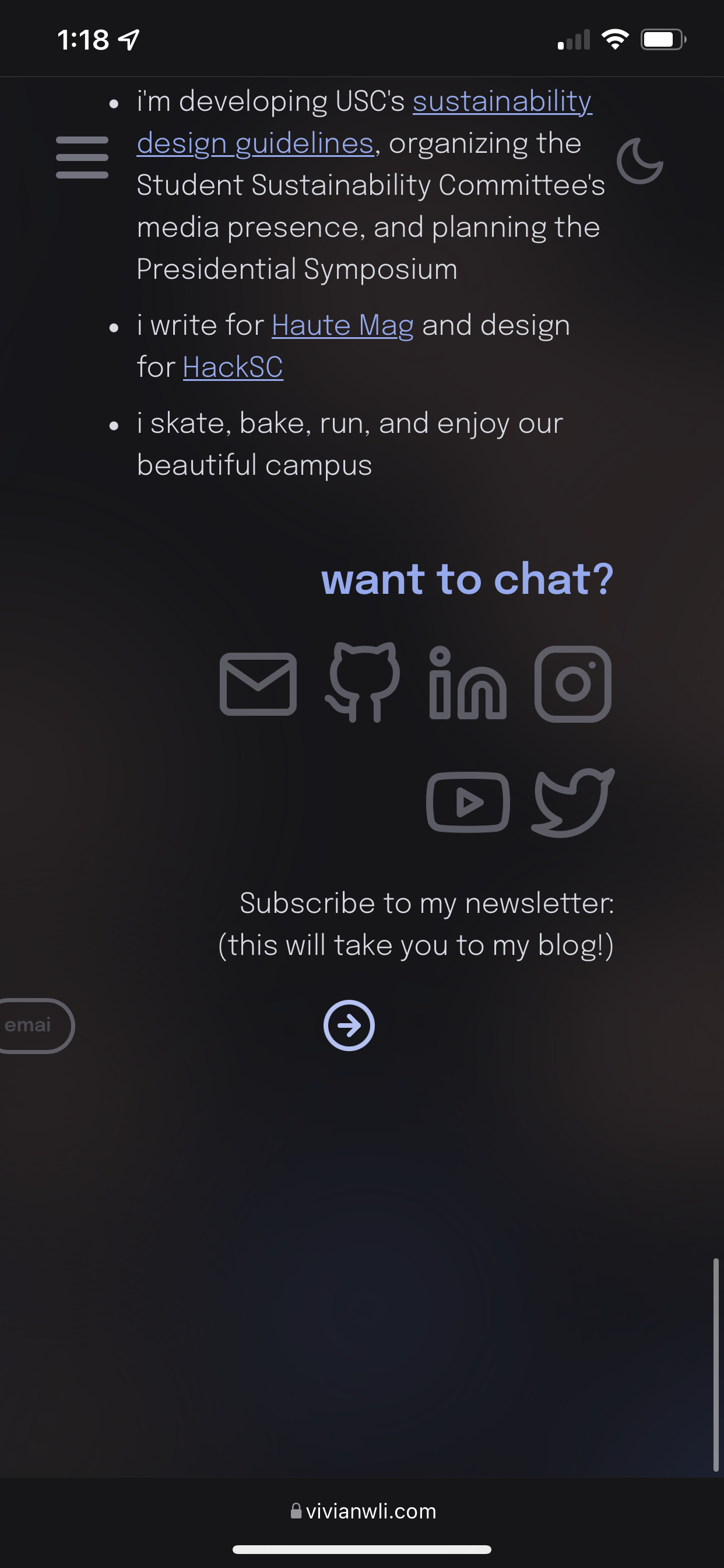
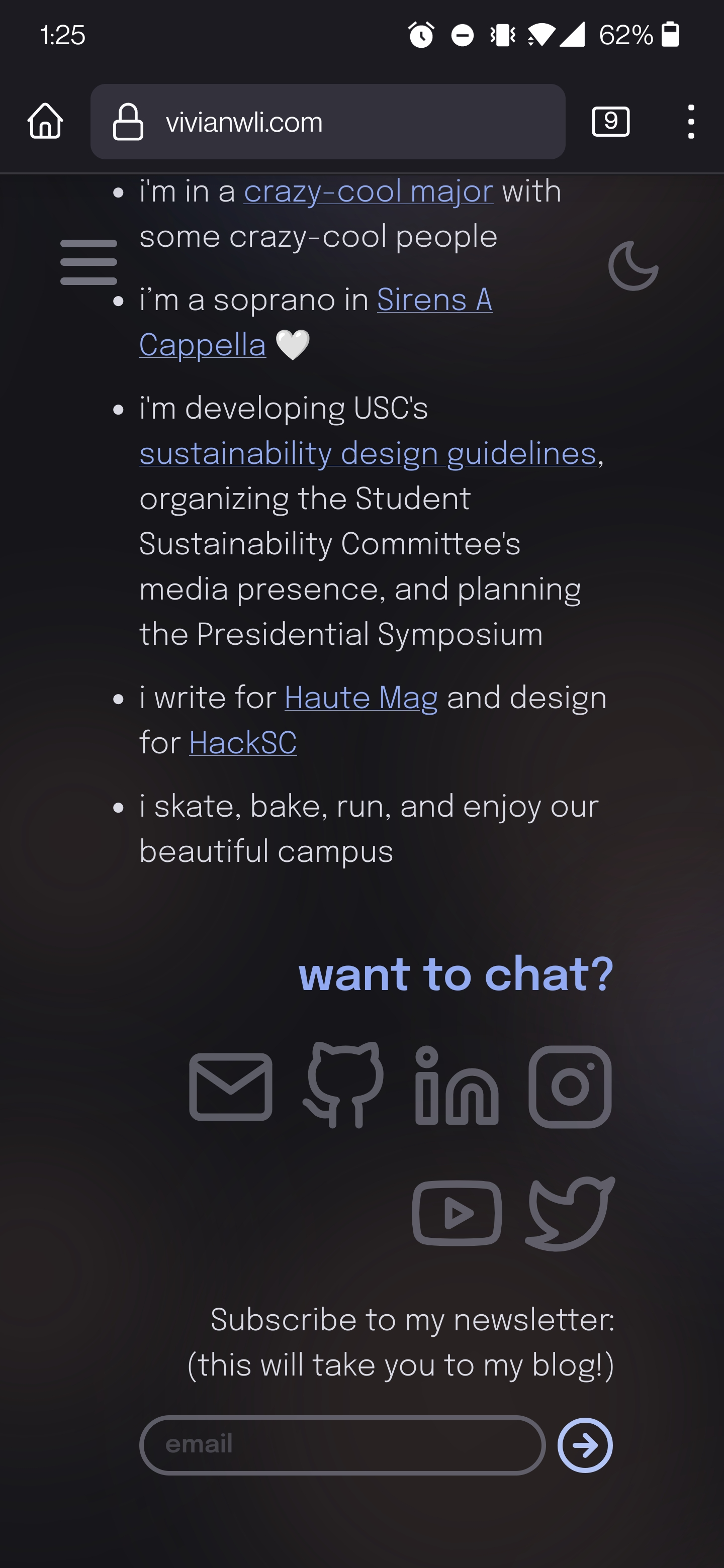
Chrome DevTools has a great option for responsive design, allowing developers to emulate different screen sizes and ensure that it looks great. However, because it’s just an emulator, my designs came out looking a bit wonky on iPhone at first. My heading text wasn’t italicized, my portfolio images were horrendously stretched (just really blurry colors), and my email form looked like this:


So if DevTools doesn’t work, what does? If you have a Mac and an iPhone, you can enable Inspect Element on your iPhone and then connect to your computer. If not, tough luck. However BroswerStack offers ten-minute trials to test on an actual iPhone. Although the time seems ridiculously short, it actually really helped! Just a bit of fiddling in DevTools got me where I wanted.
Flash of Unstyled Content (FOUC)
The first time I experienced this in dev mode, it was terrifying. My background orbs were black, my text was in Times New Roman, everything was in the wrong place. Scenes out of a horror movie. This goes away at build time, but I was also experiencing this “flash of partially-styled content” in production as well. Everything would be the right color, but the layout was still off and the margins didn’t kick in until a second later. I dealt with it for a while, but I ultimately fixed this issue by moving some of the relevant styles from __layout.svelte into app.scss. I’m pretty sure this is because app.html is used in every page and saturated with the Svelte content, so the styles from app.scss are put in place first before the rest of the page finishes loading. Victory!
Thanks
Thanks to Jason, Ailuropoda Melanoleuca, and ginkoid for answering my many questions. You guys are the best! Thanks to you, the reader, for embarking with my on my journey as well. I hope you enjoyed!
Bye
I suppose this is it. See you again when there’s a V3…?!
Just kidding. I hope to blog more often on here, so you can subscribe to my newsletter if you’d like to hear more from me. Have a wonderful day!